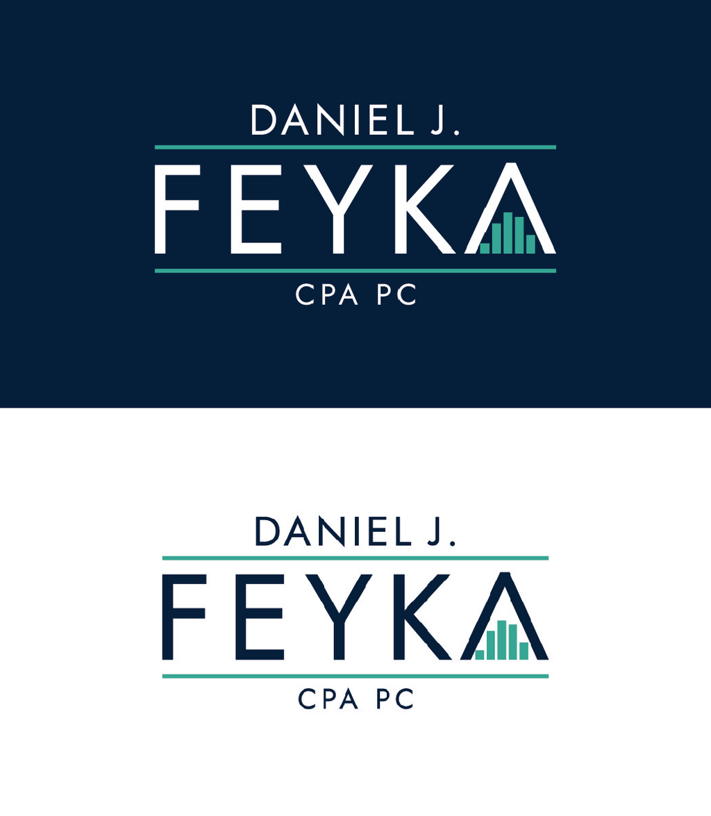
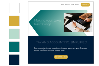
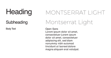
Daniel Feyka is a highly experienced accountant in the Lake Norman area. When he launched his own firm, he partnered with me to develop a cohesive brand identity that reflected both professionalism and expertise. The project included a complete brand package, magazine advertisements, and outdoor advertising design, all centered around a clean, minimal aesthetic with green and gold tones inspired by finance and growth. The portfolio images showcase the brand’s versatile visual system, including the curated color palette, font recommendations, and adaptable marketing materials designed to create a polished and recognizable presence across multiple platforms.
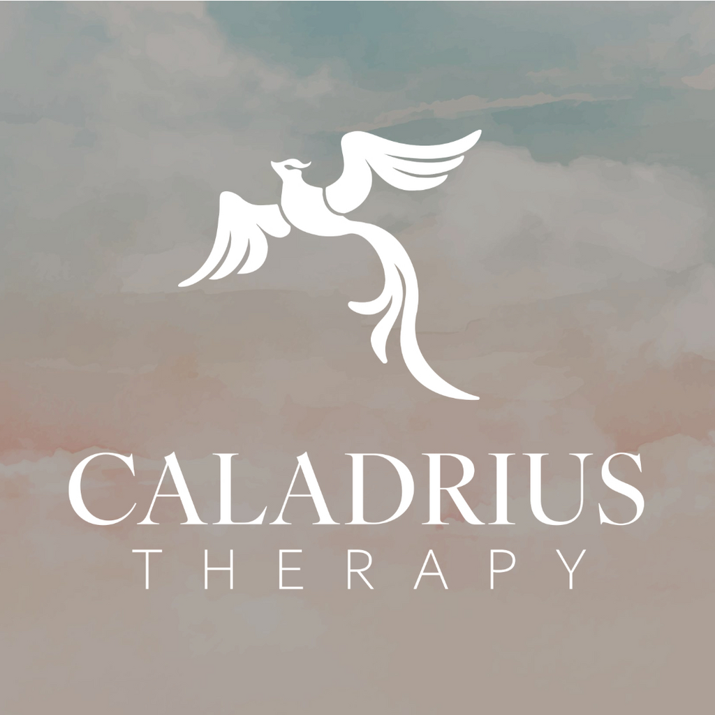
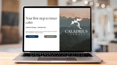
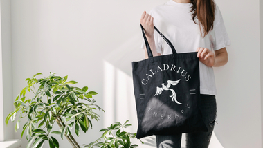
When Caladrius Therapy prepared to open a new office, the team sought a thoughtful rebrand that would reflect both healing and professionalism. Their branding package included a modernized logo, curated font pairings, a calming color palette, and customizable social media templates to ensure a cohesive presence across platforms. The updated logo was inspired by their original symbol — the caladrius, a mythological bird believed to heal and disperse pain — reimagined with a clean, contemporary style. Soft garden-inspired tones and modern classic typography were chosen to create a welcoming, reassuring identity that aligned with the practice’s compassionate approach to mental health care.
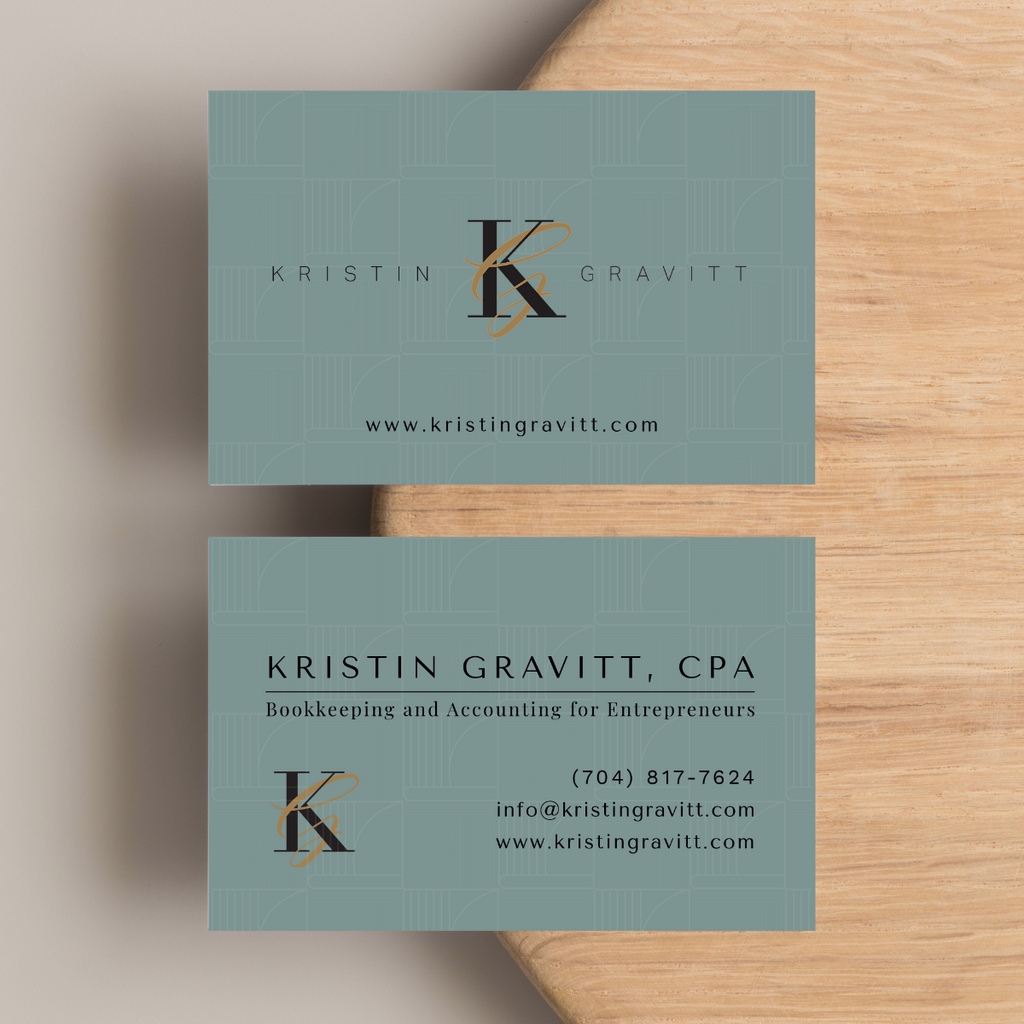
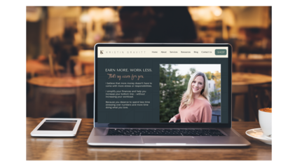
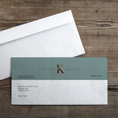
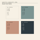
When Kristin Gravitt underwent a rebrand for her accounting business, the goal was to create an identity that balanced professionalism with approachability. The project included a custom logo, curated color palette, font selections, stationery, and business card designs, all tailored to reflect her communication style — knowledgeable, trustworthy, and warmly personal. Drawing inspiration from the inviting atmosphere of modern coffee houses, we developed a sophisticated yet welcoming visual identity with rich, grounded tones and clean typography that felt both polished and approachable.
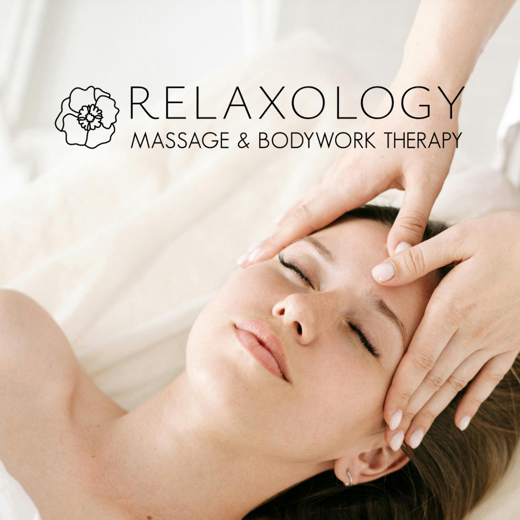
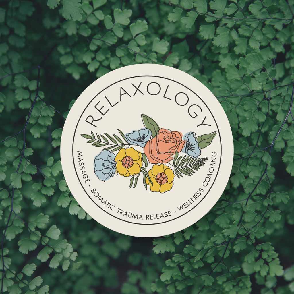
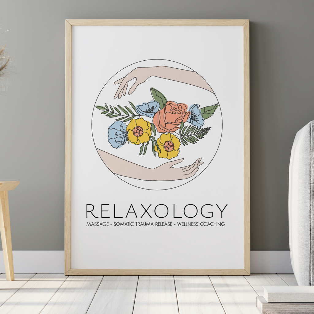
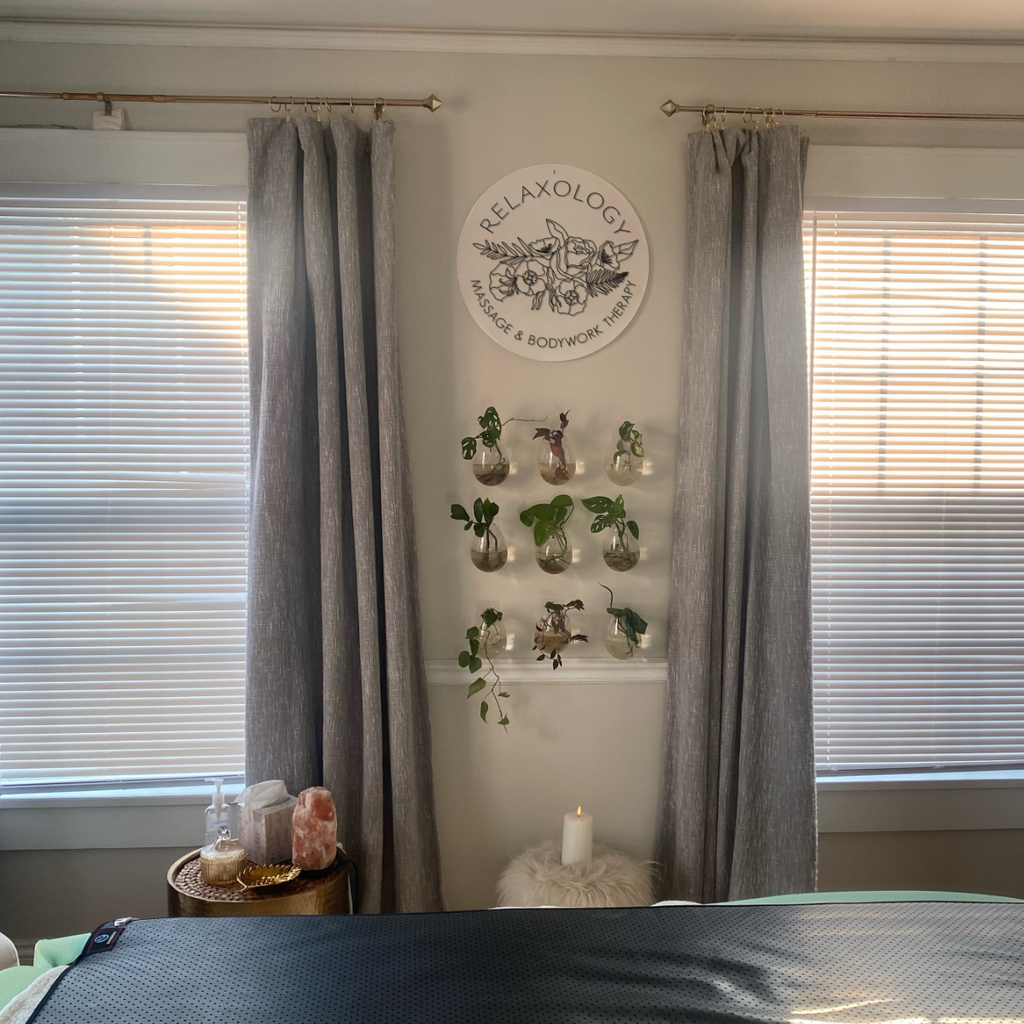

When Relaxology owner Erin set out to strengthen her brand presence, she needed a logo system that was both versatile and instantly recognizable across a wide range of applications. The project included a flexible logo design created for use on her website, social media, business cards, and both indoor and outdoor signage. Inspired by the restorative nature of massage therapy and Erin’s expertise in multiple healing techniques, the final identity balances professionalism with a calming, approachable feel. To ensure consistency across every medium, the logo package included full-color, black-and-white, and reversed white variations.
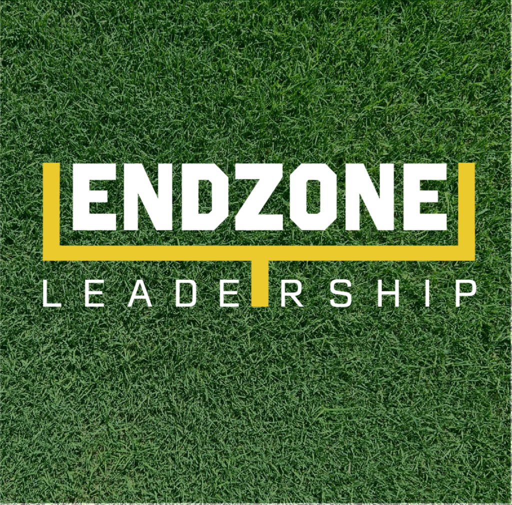
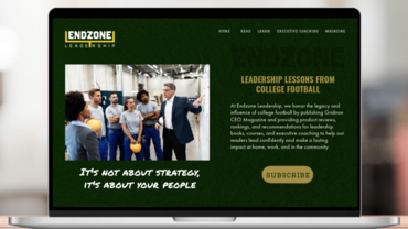
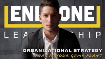
When Cam Cruickshank launched Endzone Leadership, he needed a brand identity that reflected both the discipline of athletics and the professionalism of executive leadership. The project included a versatile logo system, curated typography, and a cohesive color palette designed for use across his website and digital content. Inspired by classic collegiate branding, we developed a timeless green-and-gold color scheme paired with a stylized goalpost logo that subtly connected leadership principles with the world of college football. The final identity balances authority, energy, and approachability while creating a strong foundation for the company’s growing online presence.